
Business Card Back

Business Card Front

Flier

Fonts

Grain

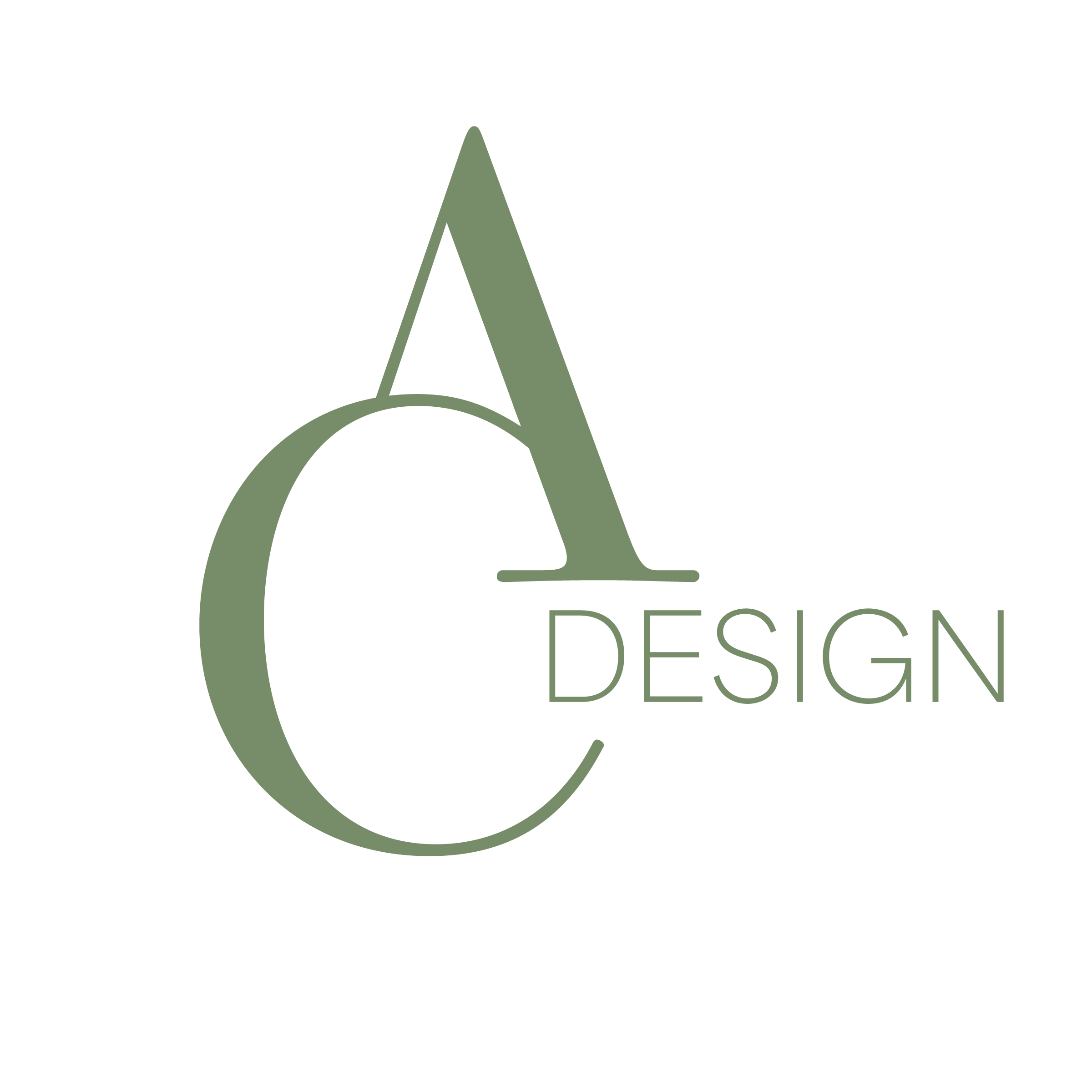
Logo
In crafting AC Design's brand identity, I aimed to balance professionalism and my free-spirited personality, infusing the design with my tastes. The starting point was the logo, seamlessly merging my initial with my last.
My choices were deliberate regarding font selection, drawing inspiration from the clean lines and modern aesthetics of prominent brands like Zara and YSL. To unite the word "design" with my logo, I playfully experimented with its placement until I found the perfect fit – nestled neatly between the A and the C.
Incorporating green as a primary color reflects my affection for its calming yet sophisticated qualities. This choice sets the tone for the rest of the brand's aesthetic, rooted in my love for old photography's vintage charm and aesthetics. Adding a grain texture to the brand identity was a nod to this vintage love, lending a timeless quality to the visual elements.
This approach blends professionalism with a casual, personal touch, effectively capturing the essence of AC Design's unique and appealing brand identity.

Promotional Imaging

Promotional Imaging

Promotional Imaging

Promotional Imaging

Instagram Post

Headshot
I opted for a personal touch for my advertising efforts, featuring portraits that captured me amidst a scattering of my work created over time. The goal was to convey the balance I strike between my photography and design skills while presenting myself as a real person rather than an anonymous one hidden behind a computer screen.
Promotional video for landing page and Instagram


