Overview:
Quant is a quantitative finance club at the University of Illinois at Urbana-Champaign that aims to equip students with the skills, knowledge, and hands-on experience needed to excel in the field of quantitative finance. Through brand-building efforts, we helped Quant develop a cohesive and professional visual identity, along with advertising materials and other resources that support their mission. These materials not only enhance the club’s visibility on campus but also communicate its dedication to bridging the gap between academic theory and industry practice.
Mission Statement:
"At Quant, our mission is to help students break into Quantitative Finance and High Frequency Trading. We partner with a multitude of firms to help provide you the network, resources, and funds to conduct research and implement industry-relevant strategies and technologies. Our divisions: Trading, Research, Software, and Operations."
Target Audience:
The primary audience includes undergraduate students at UIUC who are interested in pursuing careers in quantitative finance, data analytics, or financial engineering. Secondary audiences include finance and analytics professionals, alumni, and corporate partners looking to engage with talented, motivated students in the field.
Style Sheet
Brand Guide
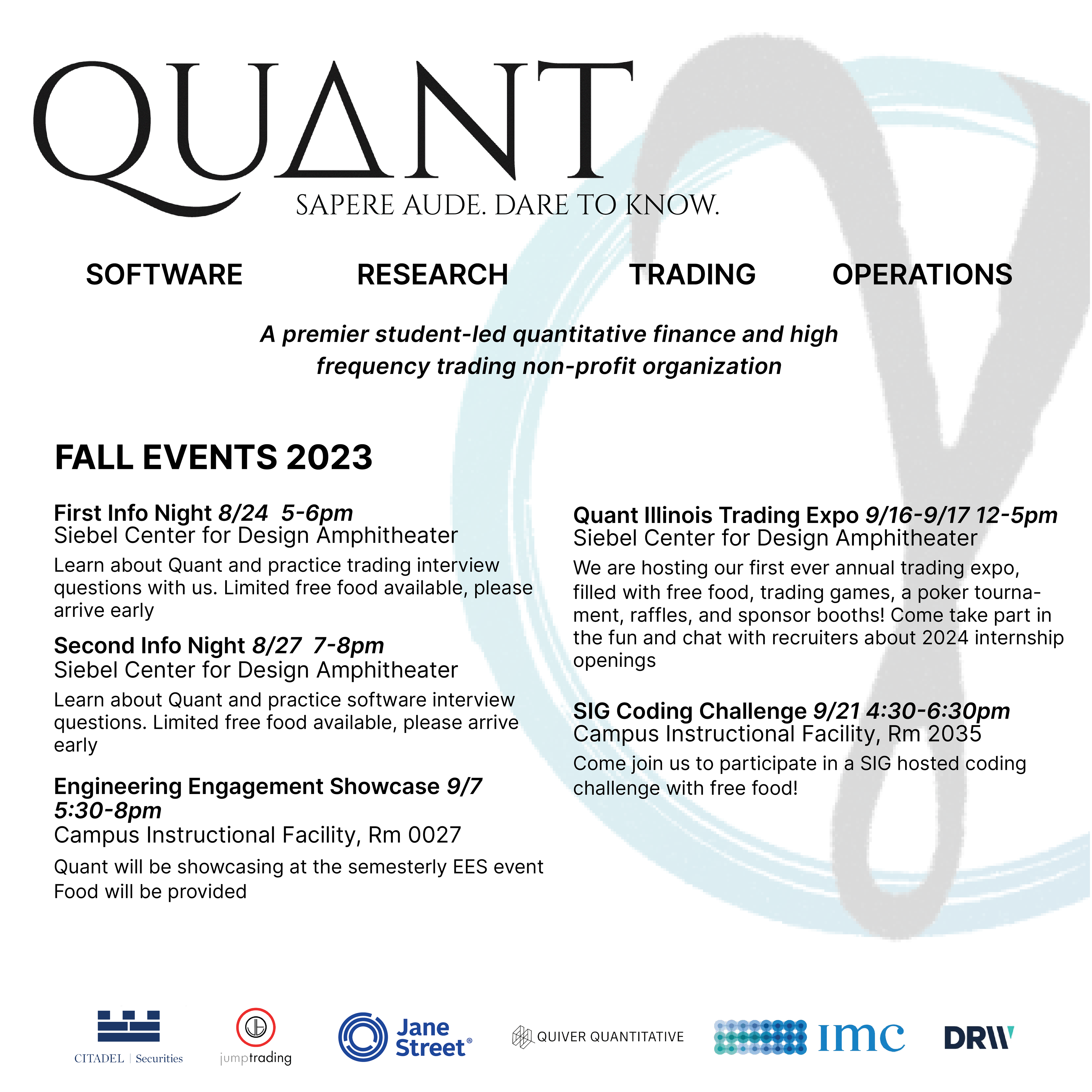
Flyers
TV Display
Poker Cards Final Draft
The final deck could not have been made possible without the help of Chloe Bielema (Joker) Charlotte Watson (Queen) and Grace Althaus (Jack).
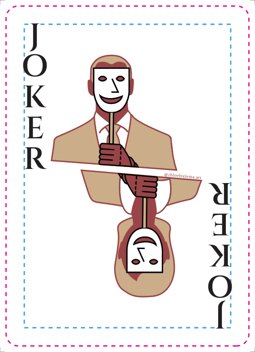
Joker (Chloe)
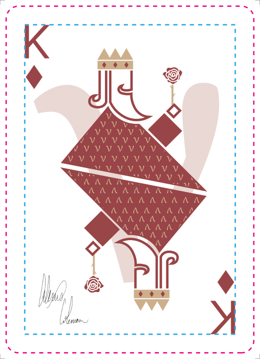
King (Me)
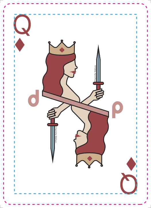
Queen (Charlotte)
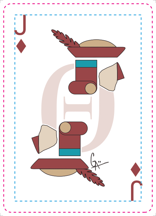
Jack (Grace)

(Chloe and Me)
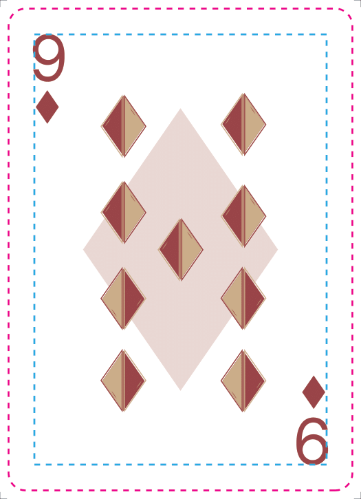
(Chloe and Me)

(Chloe and Me)
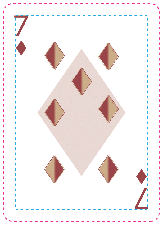
(Chloe and Me)

(Chloe and Me)
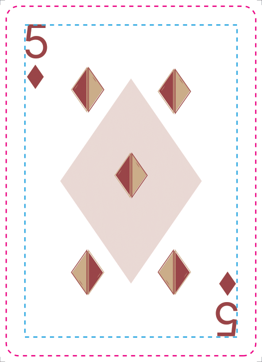
(Chloe and Me)

(Chloe and Me)
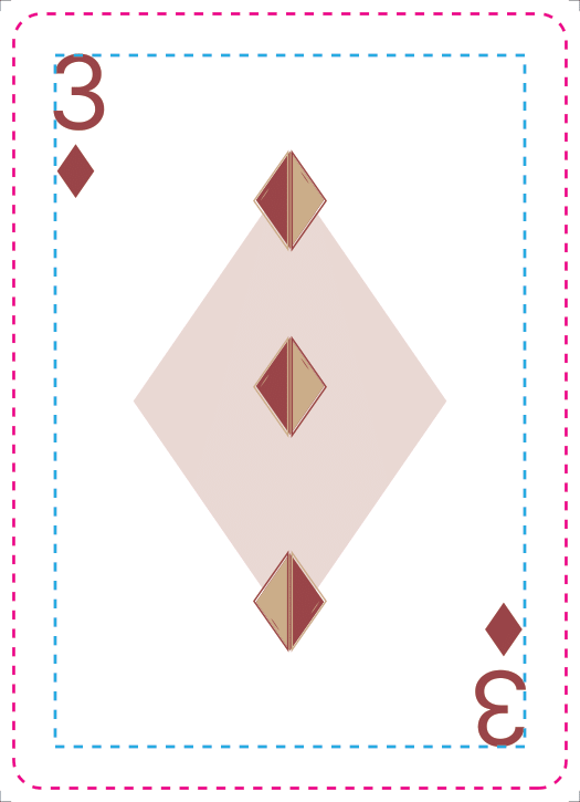
(Chloe and Me)
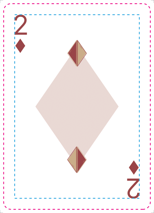
(Chloe and Me)
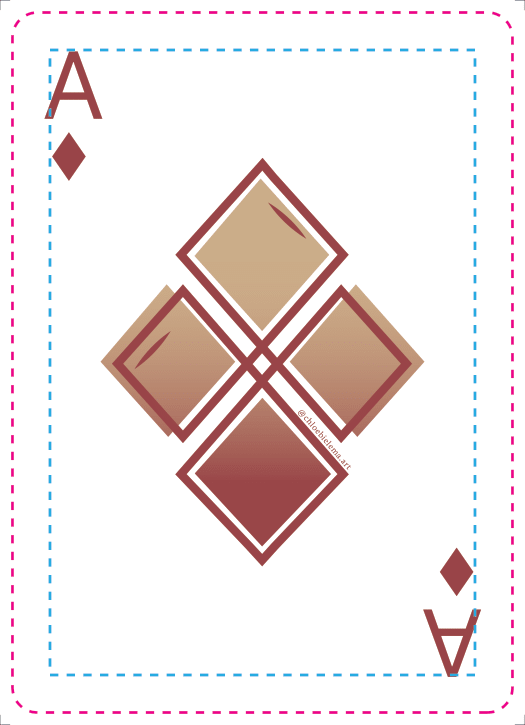
Diamond Ace (Chloe)
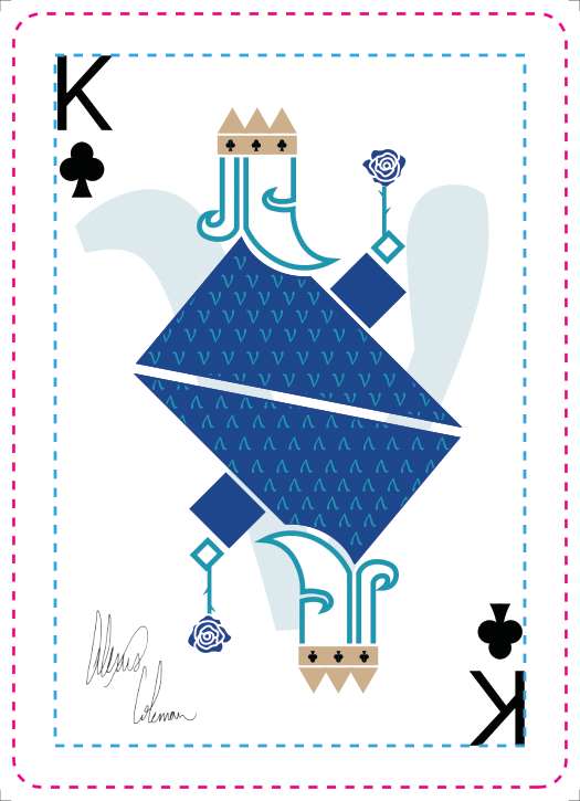
King (Me)
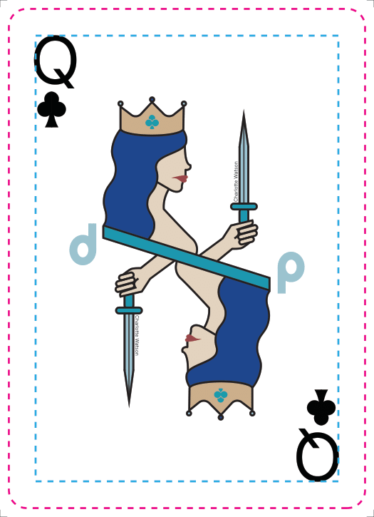
Queen (Charlotte)
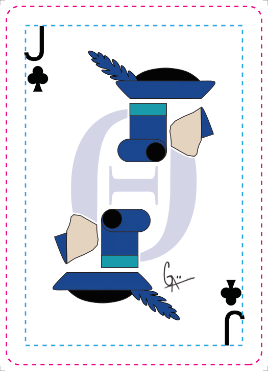
Jack (Grace)
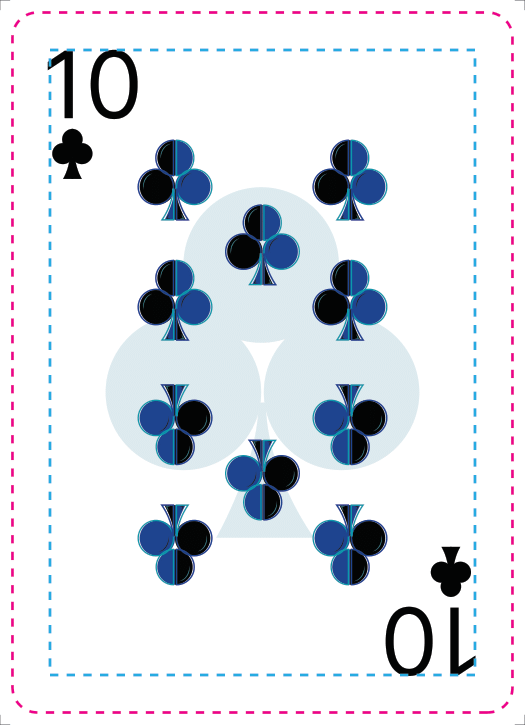
(Chloe and Me)
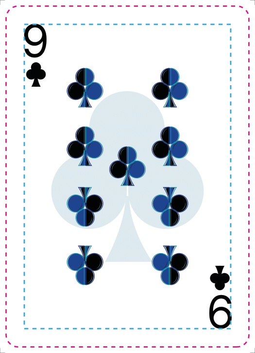
(Chloe and Me)
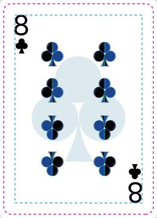
(Chloe and Me)
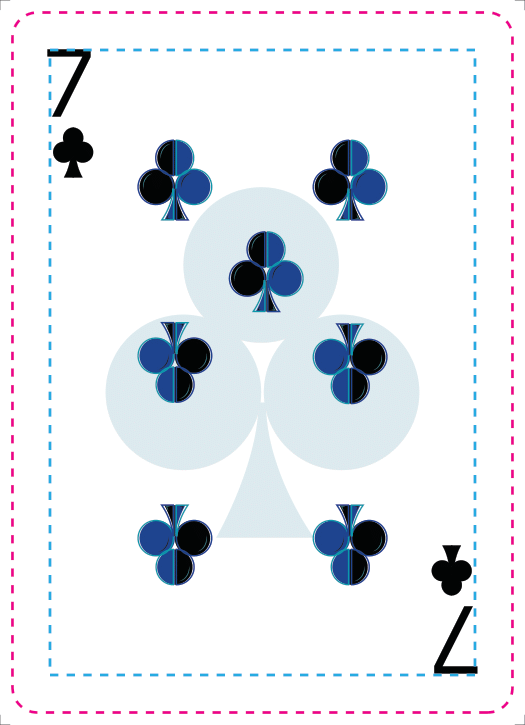
(Chloe and Me)
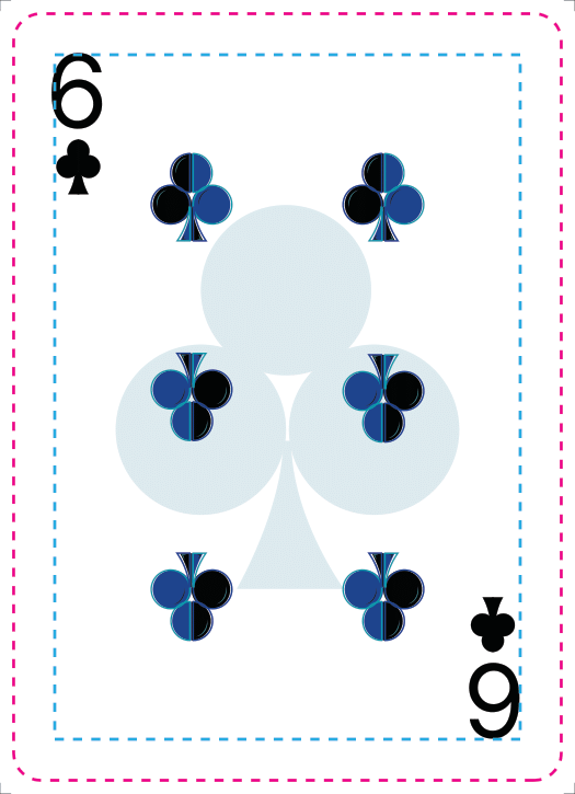
(Chloe and Me)
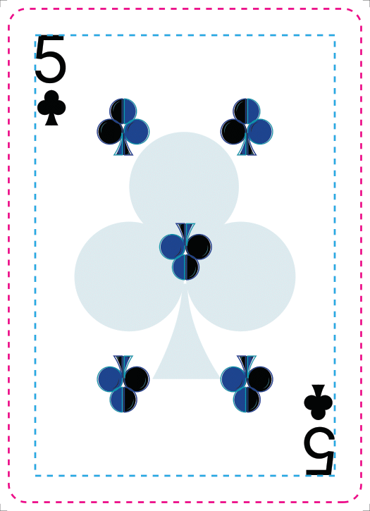
(Chloe and Me)
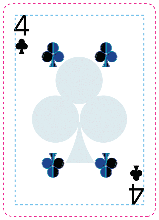
(Chloe and Me)
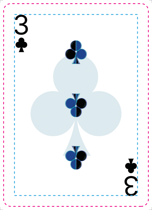
(Chloe and Me)
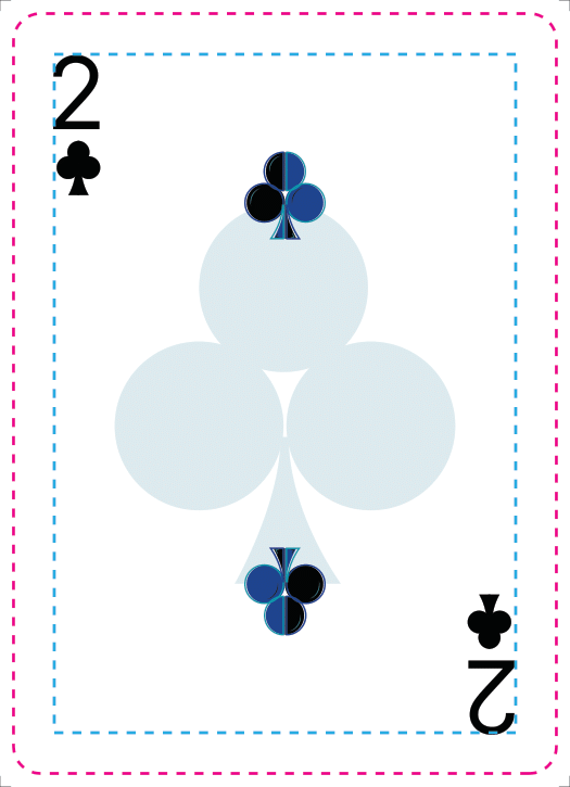
(Chloe and Me)
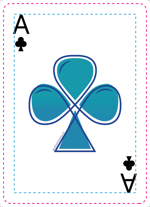
Club Ace (Chloe)
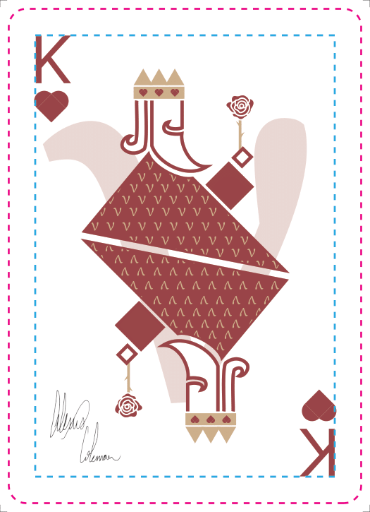
King (Me)
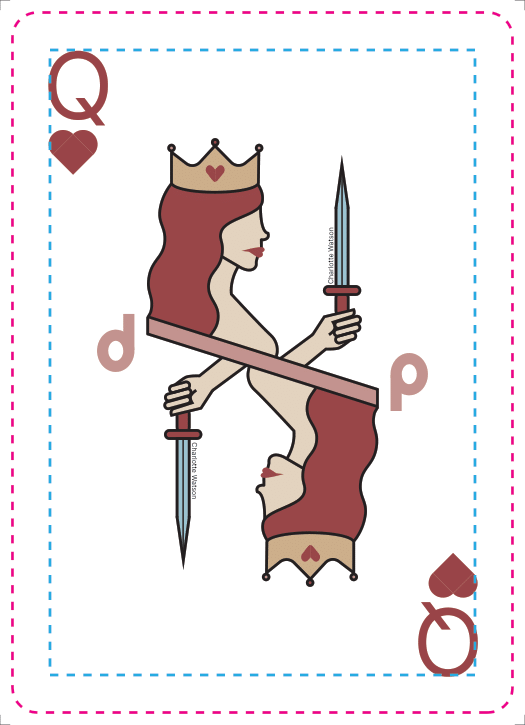
Queen (Charlotte)
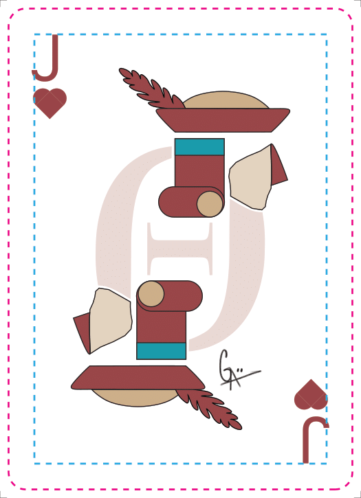
Jack (Grace)
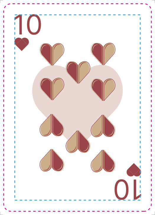
(Chloe and Me)
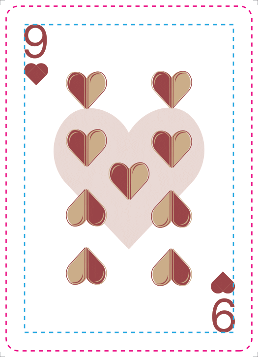
(Chloe and Me)
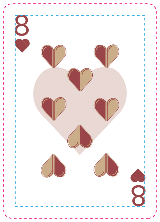
(Chloe and Me)
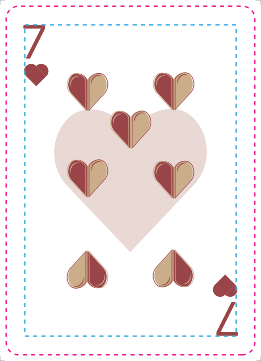
(Chloe and Me)
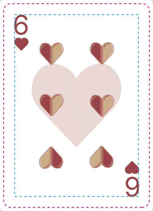
(Chloe and Me)
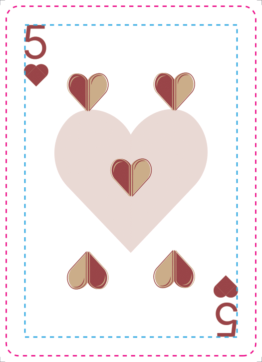
(Chloe and Me)
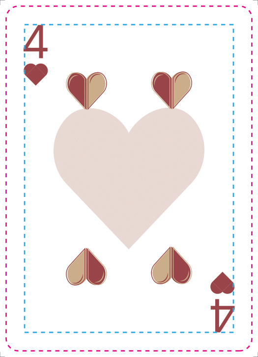
(Chloe and Me)
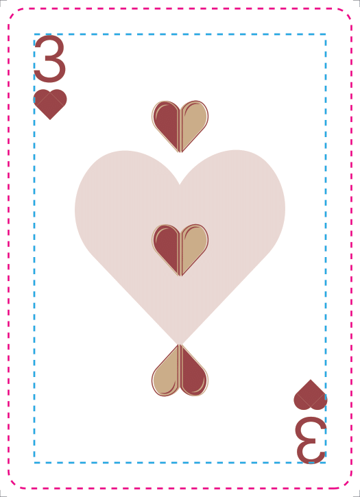
(Chloe and Me)

(Chloe and Me)
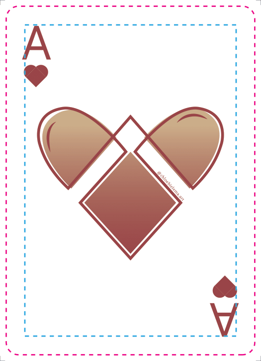
Heart Ace (Chloe)
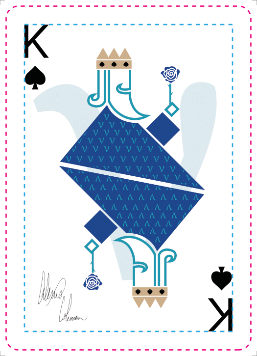
King (Me)

Queen (Charlotte)
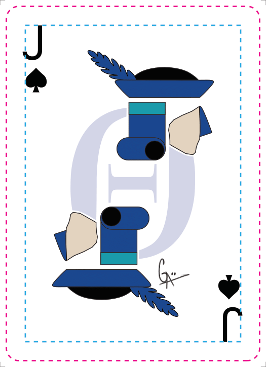
Jack (Grace)
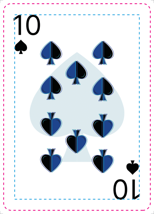
(Chloe and Me)
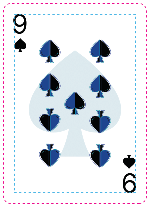
(Chloe and Me)
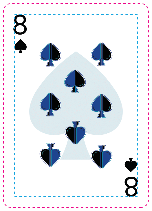
(Chloe and Me)
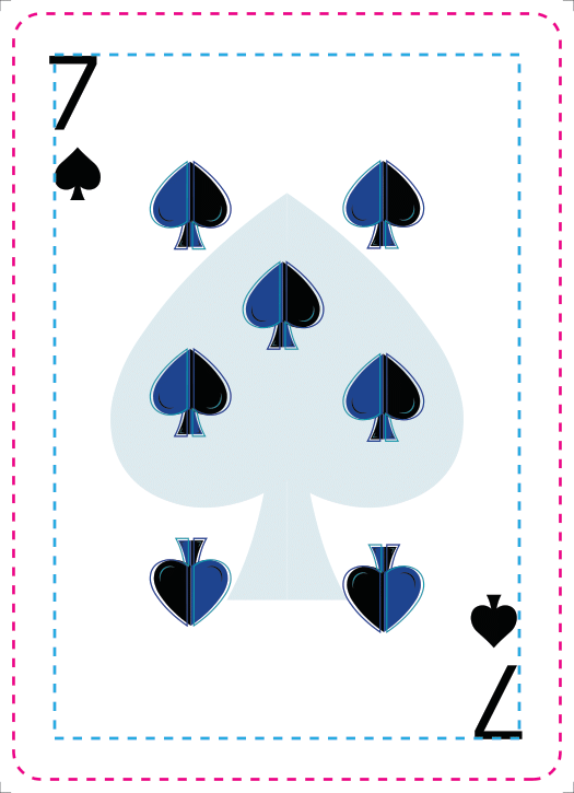
(Chloe and Me)
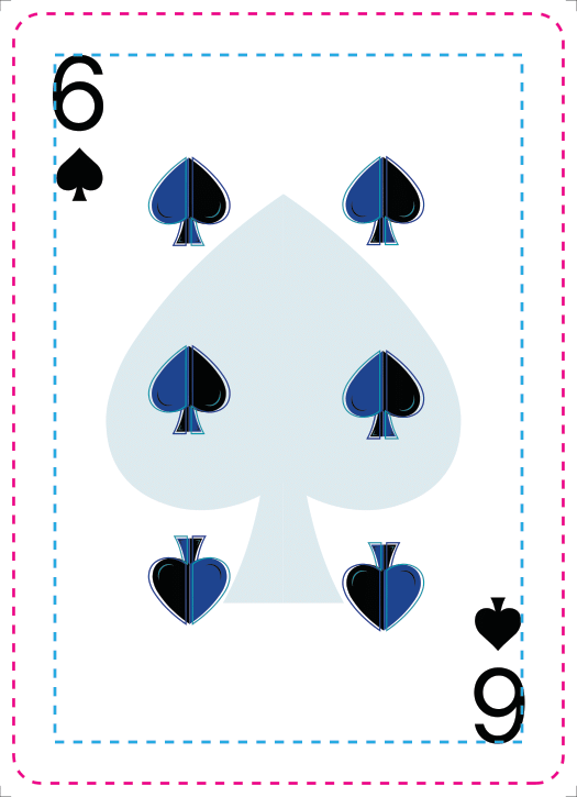
(Chloe and Me)
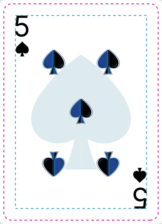
(Chloe and Me)
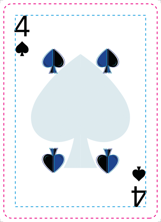
(Chloe and Me)
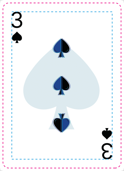
(Chloe and Me)
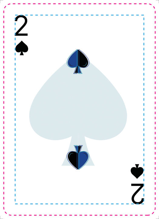
(Chloe and Me)
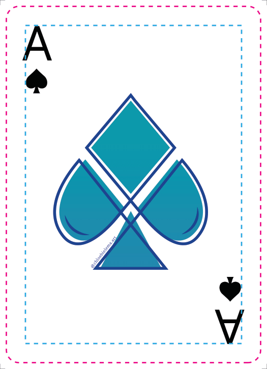
Spade Ace (Chloe)
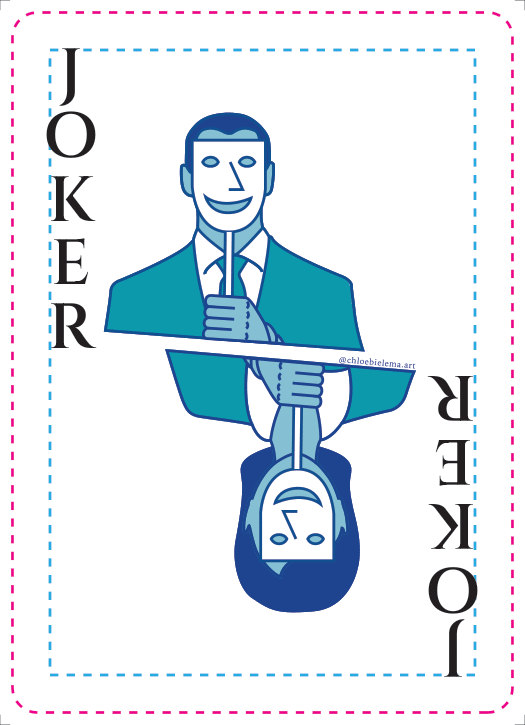
Joker (Chloe)
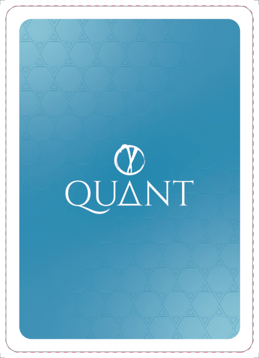
Back (Me)
Instagram Posts
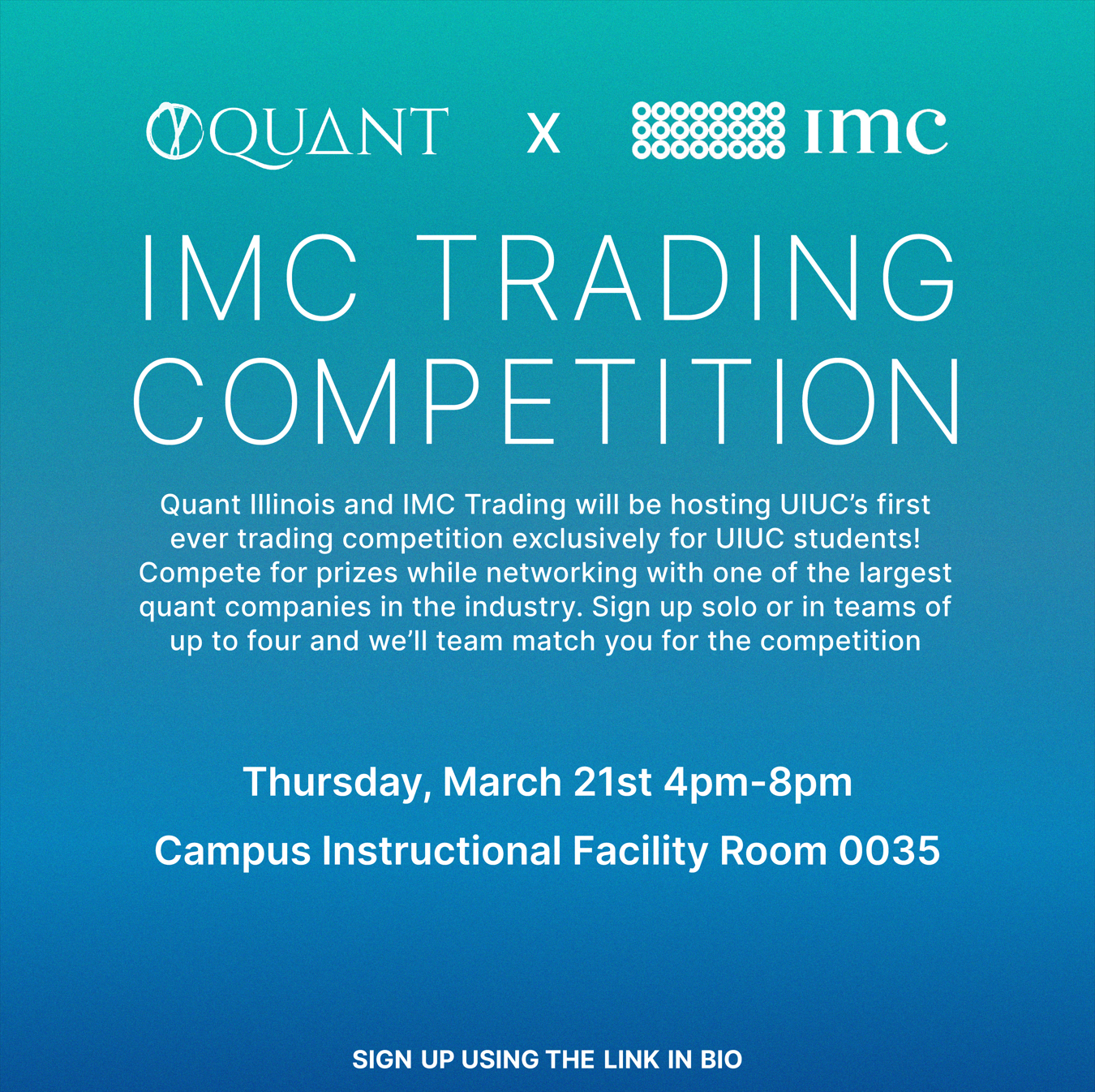
Instagram Quant x IMC Presenter Video
